A personal reflection on how human factors of light, colour and visual perception influence and affect my creative work including future considerations and experimentations.
The Blind Spot
We humans don’t always see what’s really there. Scientists agree part of each human eye does not have any photoreceptors. This receptor-less part is where the optic nerve head meets the eyeball. Here we find the scientists’ “blind spot” (Serendip, 2018).
Why don’t humans see these blank spots in our vision? In his article “Blind Spots”, V.S. Ramachandran suggests the brain as “fills in” the visual perception of this area (as cited in Serendip, 2018). The experiments we took part in the lecture demonstrates some of Ramachandran’s evidence for this idea of filling in.
In contrast, Derksen (2005) takes an informational processing view and argues that the brain simply ignores the blind spot area because there is no ‘Visual Qualia’, i.e., nothing there we consciously experience. We’ll touch on information processing and design later.
Another way of looking at it (see what I did there) is that the blind spot itself is a physical obstruction or “physical occluder” (Durgin, et al., 1995, p. 8). Instead of the brain ‘filling in’ what’s missing or understanding colours near the blind spot the way Ramachandran describes, it’s a result of other visual phenomena such as “subjective or illusory contours and amodal completion” (Derksen, 2005, p. 2). Whichever of these schools of thought you support; as designers we can agree that these physiological and phycological effects of visual interpretation affects creative work.
Reflection
This visual ‘filling in’ was something we used on a group project at Ryerson University, where we were asked to propose a residential re-development of an existing site.
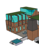
Our proposal included an extension made of mostly glass, with a sloped roof, surrounded by vertical posts and beams (Dare & Cooper, 2007). This created the illusion of a box shape without committing to that shape physically.
Does this visual ‘filling in’ affect the way that dyslexic readers perceive words? If my eyes need to keep moving around to see past this ‘blind spot’ then could that be why perceptually people see words move?
The Amazing Brain
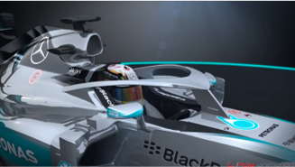
The brain has a remarkable ability to process and sort visual information. Here’s an example. When you look at the designs of F1 cars from 2018 onwards, you’ll see they have a new safety device called the halo. The halo was designed to prevent debris crashing into cars and other objects from hurting the driver. At first, the design looks rather strange; how can drivers see where they are going with a large obstruction in front of them? However, drivers rarely look straight ahead during a race and certainly not right at their cars. Instead, race car drivers look around and rely on peripheral vision. So, the centre stalk of the halo on their car doesn’t seem to affect their vision. This safety device has become an accepted part of racing gear.
Reflection
- Blue is the hottest part of a flame, but I associate red with heat. Is this because when we see flames it is the red colour that is the most prominent? Or is it the experience of feeling the heat coming from red flames?
- If your brain is so amazing, why does it sometimes get mixed up?
Our brain is doing so much work processing visual information, it’s no surprise it can sometimes get a little mixed up – or even fooled. Our brain is doing all of this work but it can’t consciously process all of the data and information our eyes can see. Is this why we often feel emotions around colour? Are we ‘seeing’ things subconsciously?
If we can’t really see everything that’s out there, then maybe we can influence what people believe about an object by using other information. Is something better quality because it looks like it is, or because we’ve been told?
The Power of Colour
The experiments and discussions in this block demonstrated to me that colours in close proximity to others can create interesting effects. For example, colour can change how we perceive the shape of a room or the appearance of a colour’s saturation.
Reflection
I studied interior design at Ryerson University. During my first semester of undergrad, we were not permitted to use colour in our work. This restriction was intended to help us learn about space and shadows. When I reflect on that time now, I still believe this approach was an excellent strategy for beginning interior designers. Designing without colour helped me understand some fundamental design concepts without the distraction of colour stimuli.
Later in the degree program, when we started incorporating colour into our designs, we experimented with colour to modify spaces to achieve a desired effect, such as through contracting or expanding wall placements or features. While these experiments were not the same as the ones conducted during the human factors lecture and related assignment, the underlying concept of using colours to alter visual perception was similar. I believe experimenting with putting colours together to see what works and what doesn’t is important in creative work – because sometimes a theory is just a theory.
Some dyslexics when identified have a reading test where they are asked to read using a variety of coloured sheets as an aide. I’ve heard generally that there is some anecdotal evidence that colour can help improve reading ability in Dyslexics. I plan to explore this further and see if, instead of a film to go over a book or sheet of paper, can a desk lamp be designed to produce a similar effect?
The Design of Information & Communication
If our brain is ‘filling in’ using other pieces of information, whether that be experience, other visual pieces of information, touch, smell, etc., designers need to be especially careful how we express information through colour. I’ve often seen colour used in information design to represent a category or highlight something, and I know that when I create a report for a high-level executive, if I put a piece of information in red that’s perceived as bad. If I put it in green, that’s usually good. In my professional work, it can get confusing when I’m asked to use an all green colour scheme to align with the company’s green branding. There are only so many shades that work well together and have sufficient contrast to tell any kind of story!
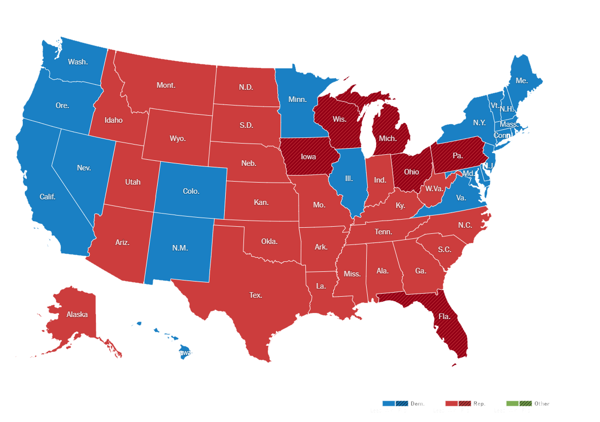
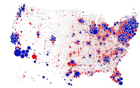
Sometimes an initial idea of how to represent information through colour categorisation can end up being misleading – not a good idea when discussing data (unless you intend to be misleading!). Take the data visualization in Figure 2 showing the 2016 US Presidential election results by geographical area (Red= Republican, Blue = Democrat) (Noe, 2019) In this image it appears that red has an overwhelming majority because it takes up most of the visual field. But this is not the case, in fact the election was very close, 232 blue and 306 red votes (and 48% to 45% popular vote). (The New York Times, 2017)
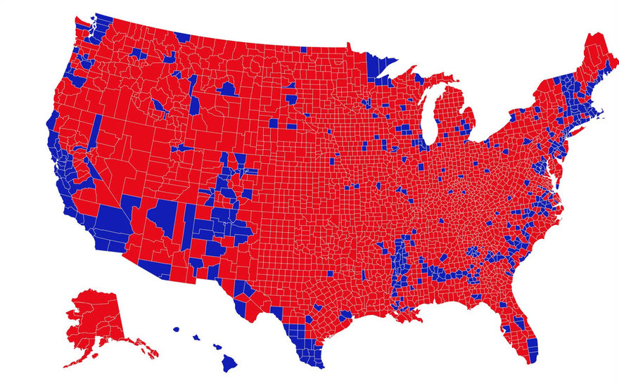
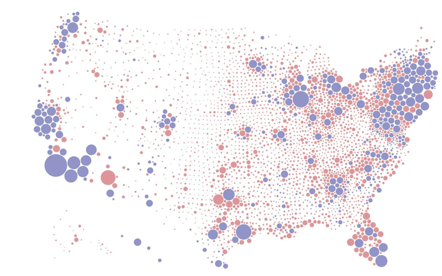
Even if we look at the map by county instead of state as seen in Figure 3, Red is the overwhelming colour. Data Scientist Karim Douieb (as cited in Noe, 2019) created a new visualization below which shows votes by population size in their geographical area. Neither of these two maps (Figures 2 and 3) really give the impression of an almost 50/50 race. There will be voters who voted for Blue in an area where Red won, and visa versa. Rain Noe (2019), author of the article “A Great Example of Better Data Visualization: This Voting Map GIF”, suggests that if you zoom out, or in this case create make the image smaller. It would start to appear more of a purple colour (mix of red and blue). Which might be a better representation of how the country voted at the time. Additive colour mixing and the Pointillism artists of the 1880’s as we know suggest this may work.
Experiment 1: As an experiment, I first tried zooming out/ shrinking like the author suggested. But to my eye, this approach didn’t appear to work to blend the colours. Perhaps this failure to blend may be because the saturation of these colours are so strong. Alternatively, the bubbles might not be detailed enough to mimic the effects that Pointillism creates.
Experiment 2: Next I tried to reduce the saturation to get the purple effect as perhaps the colours were too strong to blend. (see Figure 6)
Experiment 3: On my third attempt I changed only a select number of dots to have different saturation levels. The result was closer to a blend, but really not what our friend Rain Noe was looking for. (see Figure 7)
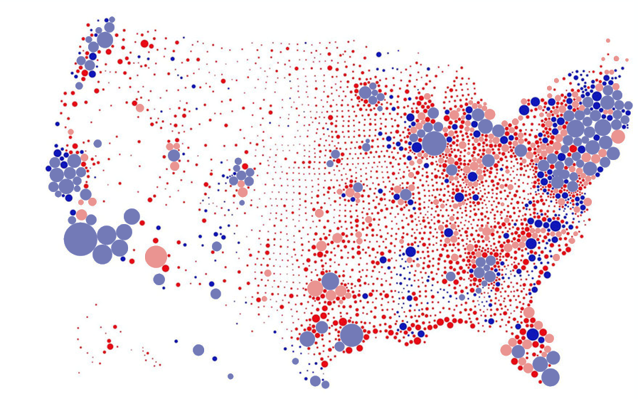
Experiment outcomes: The brain does a lot of filling in and can mix colours (which is why computer screens work, thank you brain!). But in the case of the American voting map, the points are too large and two colours don’t appear to be enough to trick the brain.
I was curious, however, to know whether more detailed data from individual polling station were available, could a version of the map Rain Noe was imagining be possible? A little internet searching reveals that this is still not the case. (See Figure 8). At this point, I began to reflect that perhaps the goal of communicating the popular vote graphically through colour wasn’t the best way to express what happened.
For me, this series of experiments helped reinforce the idea that it is important to think critically about using colour to represent information. Colour can be helpful to visualise data but must be used expertly, so that it is not misleading.
The stories we tell
Colour is a key tool in filmmaking. In his book “If it’s purple, someone’s gonna die the power of colour in visual storytelling” Bellantoni (2013) describes, analyses, and explores the use of various colours in film. He organises his thoughts by colour, a chapter for red, yellow, blue, orange, green and purple, with subcategories of each colour. Filmmakers know their target audiences, and they rely on our instinctual, psychological associations with different colours to induce emotive responses. (Note: responses to colours may be culturally different for some colours).
Reflection
The animated movie, UP, is a great example of the clever use of colour saturation (in my opinion). The strongest use of colour for emotion is at the beginning, where the main characters are together and happy. Correspondingly, the colours are bright and saturated. Combined with music and imagery, we instinctively know to feel happy at this point of the film. The movie colours then fade to greys and blues, and we instinctively feel sadness in response. Emotion cleverly conveyed through colour. Completely without spoken word.
Colours can evoke emotions, they can remind us of things, they can even be related to certain things culturally and through our experiences. Is this enough information? I wondered. Could I tell a story completely using blocks of colour?
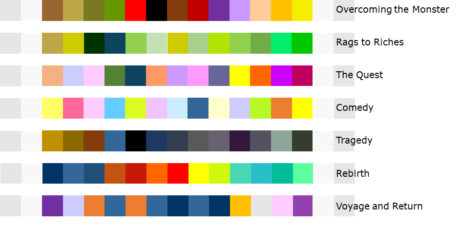
For this experiment I’ve decided to stick to the theory of 7 basic storylines as described by Christopher Booker in his book “The Seven Basic Plots: Why We Tell Stories” (2004). The basic ‘hero’ storylines are Overcoming the Monster, Rags to Riches, The Quest, Voyage and Return, Comedy, Tragedy, Rebirth. See if you can tell which is which.
And if not, don’t worry, the human eye can only see certain spectrums of light – so we are all a little blind anyways.
Reflective Report References
Bellantoni, P., 2013. If It’s Purple, Someone’s Gonna Die: The Power of Color in Visual Storytelling. Abingdon: Focal Press.
Booker, C., 2004. The seven basic plots : why we tell stories. London: Continuum.
Dare, F. & Cooper, C., 2007. Sense (Residential Design). [Design] (Ryerson University).
Derksen, A. A., 2005. Dennett’s Rhetorical Strategies in Consciousness Explained. s.l.:s.n.
Durgin, F., Tripathy, S. & Levi, D., 1995. On the Filling in of the Visual Blind Spot: Some Rules of Thumb. Perception, 01 February, Volume 24, pp. 827-840.
Lapowsky, I., 2018. Is the US Leaning Red or Blue? It All Depends on Your Map. [Online]
Available at: https://www.wired.com/story/is-us-leaning-red-or-blue-election-maps/
[Accessed 07 November 2020].
Mercedes FIA, 2015. Video – Mercedes cockpit protection concept. [Online]
Available at: https://www.formula1.com/en/latest/technical/2015/8/video—mercedes-cockpit-protection-concept.html
[Accessed 09 November 2020].
Noe, R., 2019. A Great Example of Better Data Visualization: This Voting Map GIF. [Online]
Available at: https://www.core77.com/posts/90771/A-Great-Example-of-Better-Data-Visualization-This-Voting-Map-GIF
[Accessed 07 November 2020].
Serendip, 2018. More blind spots. [Online]
Available at: https://serendipstudio.org/bb/blindspot5.html
[Accessed 04 November 2020].
Serendip, 2018. Seeing more than your eye does. [Online]
Available at: https://serendipstudio.org/bb/blindspot1.html
[Accessed 04 November 2020].
The New York Times, 2017. 2016 Presidential Election Results. [Online]
Available at: https://www.nytimes.com/elections/2016/results/president
[Accessed 06 November 2020].